Pink has been a big colour trend in 2023 – not just in fashion but in interiors too. Even the world’s most influential architecture and design magazine, Dezeen, felt compelled to write about Barbiecore – the trend for pink that has crossed over from this summer’s hit film Barbie to our homes.
It isn’t a fashion for everyone, however. Using candyfloss, magenta and blush in a domestic setting needs careful consideration. Pick the wrong shade and you could have a look reminiscent of Barbie’s Malibu dreamhouse.
It may surprise you, however, that pink has long been an integral part of property design. Miami in America is a shining example of how the colour creates a sense of place and character. The city’s Art Deco architecture is often painted in shades of pink – from lifeguard towers along South Beach to hotel exteriors on Ocean Drive.
Look a little closer to home and you’ll discover that pink and property have long been intertwined. Suffolk Pink is a colour that dates back to the 14th century. It’s thought sloe berries, elderberries, blackthorn and even ox blood were added to limewash, which was then applied to the exterior of local houses to add protection. The natural ingredients tinted the mixture pink and the distinct colour was born. Today, the use of Suffolk Pink is protected and regulated by the local council and English Heritage, ensuring exterior colour continuity is achieved.
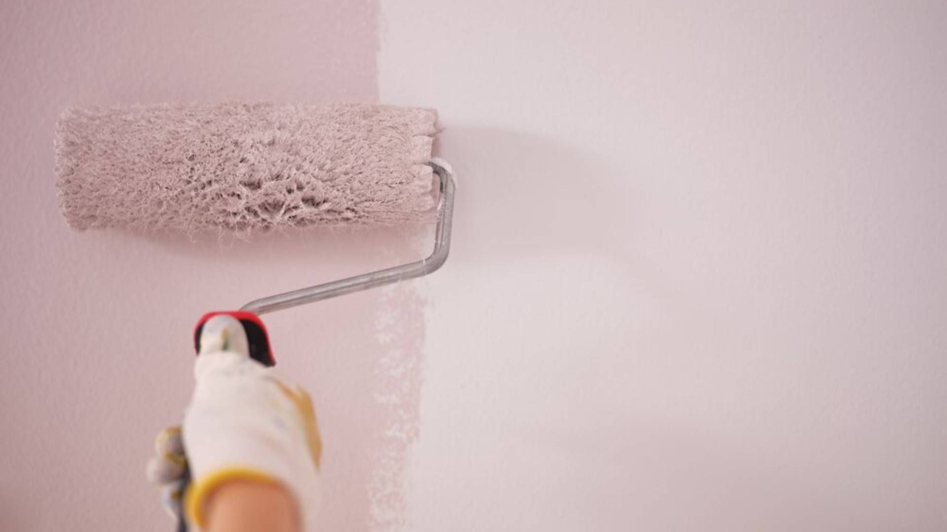
Pink isn’t going anywhere, with an updated version of the colour recently announced as the Dulux Colour of the Year 2024. Thankfully, Sweet Embrace™ is a very pale, muted pink that does not bring Barbie to mind.
It was chosen by Dulux for its warm, soft tones that create a sense of comfort with the lightest of touches. Sweet Embrace™ is actually a metameric colour, so how it looks changes throughout the day, depending on the natural light.
It starts out crisp and clear in the early morning, taking on more blush tones in the afternoon and showing off its violet hues in the evening. This makes it a great colour for spaces where you spend a lot of time, such as a home office or an open plan living/dining room.
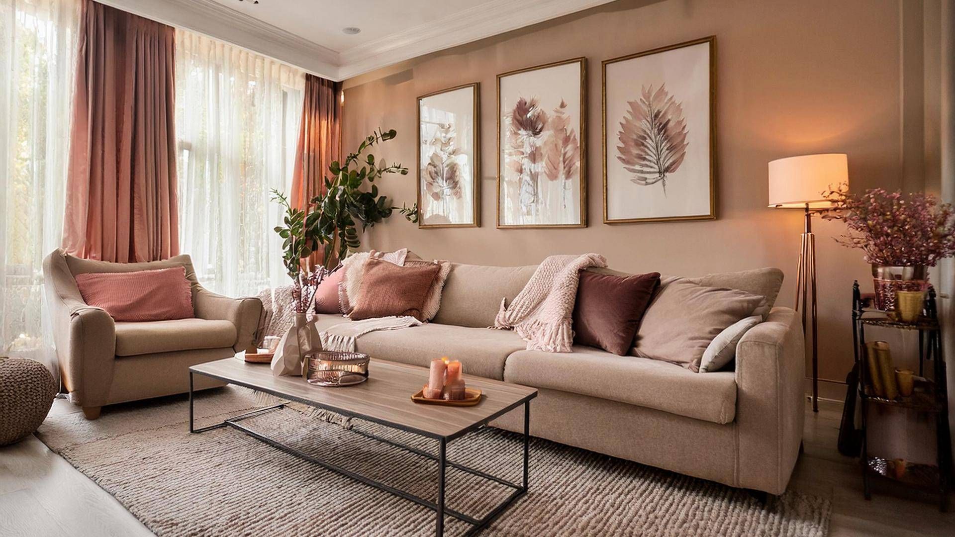
Pink can be a divisive colour as it can be very sickly, overwhelming and quite feminine. Sweet Embrace™, however, is so neutral and pale that it can be applied to every wall – even every room – and it won’t polarise opinion.
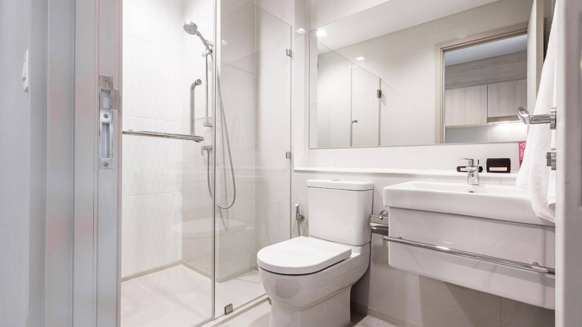
If you still have worries about pink overkill, Sweet Embrace™ was chosen for its versatility and ability to pair with other colours. Trust us when we say pale pink and black is a winning combination in the bathroom! Matt black taps, shower heads and accessories look stunning when set against walls painted in Sweet Embrace™.
Pink and green is another combination that’s already finding favour in interior design. A quick search of botanical and tropical-themed wallpaper shows pink is often used as a contrasting background colour to the palm, monstera and fern prints. You can achieve a similar impact by painting a wall in Sweet Embrace™, and positioning house plants on stands and shelves to add a dash of green.
Sweet Embrace™ can also be diluted with a liberal use of metallics. Choosing the finish carefully can help set the mood of the room. When silver is used, the ambience will be cool and calm with more lilac tones. When gold is used, Sweet Embrace™ will feel warmer and richer, with notes of freshly dried plaster. Add a metallic edge when choosing light switches, plug sockets, light fittings and picture frames.
If the current décor of your home leaves you less than inspired, contact us. Perhaps a new home is in order – one that’s ready for you to make your design mark? Call us to register for the latest available properties.
Share this article
More Articles
Sign up for our newsletter
Subscribe to receive the latest property market information to your inbox, full of market knowledge and tips for your home.
You may unsubscribe at any time. See our Privacy Policy.


