We had to check the date wasn’t 1st April but this autumn, a quite unbelievable collaboration was announced. Paint specialist Lick has teamed up with food manufacturer Heinz to launch a very special product.
Red HTK 57 is a limited edition run of paint – a juicy tomato shade that mirrors Heinz ketchup. In a playful nod to the number of varieties offered, only 570 tins will be available on a made-to-order basis.
This romanticism for red isn’t a one off either. The interiors magazine Livingetc included three shades of red in its colour trends for 2024 forecast report. Rust, burgundy and deep red are all expected to cross over from fashion into the home in the coming months.
Before you dismiss the shade, it’s worth remembering that red has always been used in interior design. Country house libraries and period-property dining rooms have long been painted in shades of oxblood and crimson. Cross over to the Alps and you’ll come across chalet chic, where warm red accents are paired with pine wood and tactile fabrics.
Head further east and you’ll find familiarity in China, where red symbolises good luck, money, happiness and joy. The shade is used liberally inside the home, where it’s paired with black and gold for a sumptuous setting.
Back in blighty, red isn’t a go-to colour when decorating as choosing the right shade can feel daunting, while painting an entire room in the wrong hue is a complicated mistake to rectify. With a little knowledge and a fresh approach, however, everyone can bring a little red into their lives.
Understanding reds
There are hundreds of reds to choose from and they span the spectrum from almost orange to the purple/pink border. What affects the appearance will be the colour pigmentation mix. Reds broadly fall into three categories:
- Warm reds: these shades will have yellow, orange and brown pigments that make warm reds earthy and more rustic.
- Cool reds: expect blue, purple and black pigments to be included in cool reds, which can make them feel regal and sophisticated
- True reds: crimson, cardinal, pillar box and vermillion are all clear reds, although they will still feature other pigments. True reds can evoke a primary school feel.
To stand the best chance of loving a red paint or wallpaper you have chosen for your home, it’s good to know the orientation of the room in question. The orientation relates to which compass point the room faces. This affects the quality of light and, subsequently, whether a red looks icy cold, warm, cosy or earthy.
- In a north-facing room: the light in north-facing rooms tends to be cool and ‘blue’, so cosiness and depth can be added with a warm red. Paints to try in a north facing room include Paint & Paper Library’s Beetlenut, Neptune’s Paprika and Coat’s Earthy Red.
- In a south-facing room: dark red shades work well in a south-facing room as they’re normally blessed with bags of golden light. Cool reds, such as Dulux’s Ruby Starlet, Little Greene’s Theatre Red and Farrow & Ball’s Preference Red will feel more upbeat and less chilly in a south-facing room.
- East- and west-facing rooms: these spaces usually receive cool light in one half of the day and warm light in the other. Coat’s Medina Quarter, Fired Earth’s Pompeiian Red and Lick’s Red 02 Matt draw on orange and pink pigments to give them versatility for these room orientations.
Complete coverage or dip your toes?
Red is a bold colour choice but you don’t have to go all in to enjoy shades of carmine, cranberry, crimson and currant. Here are three ways to introduce red to your home:-
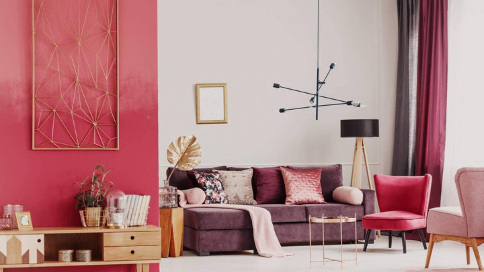
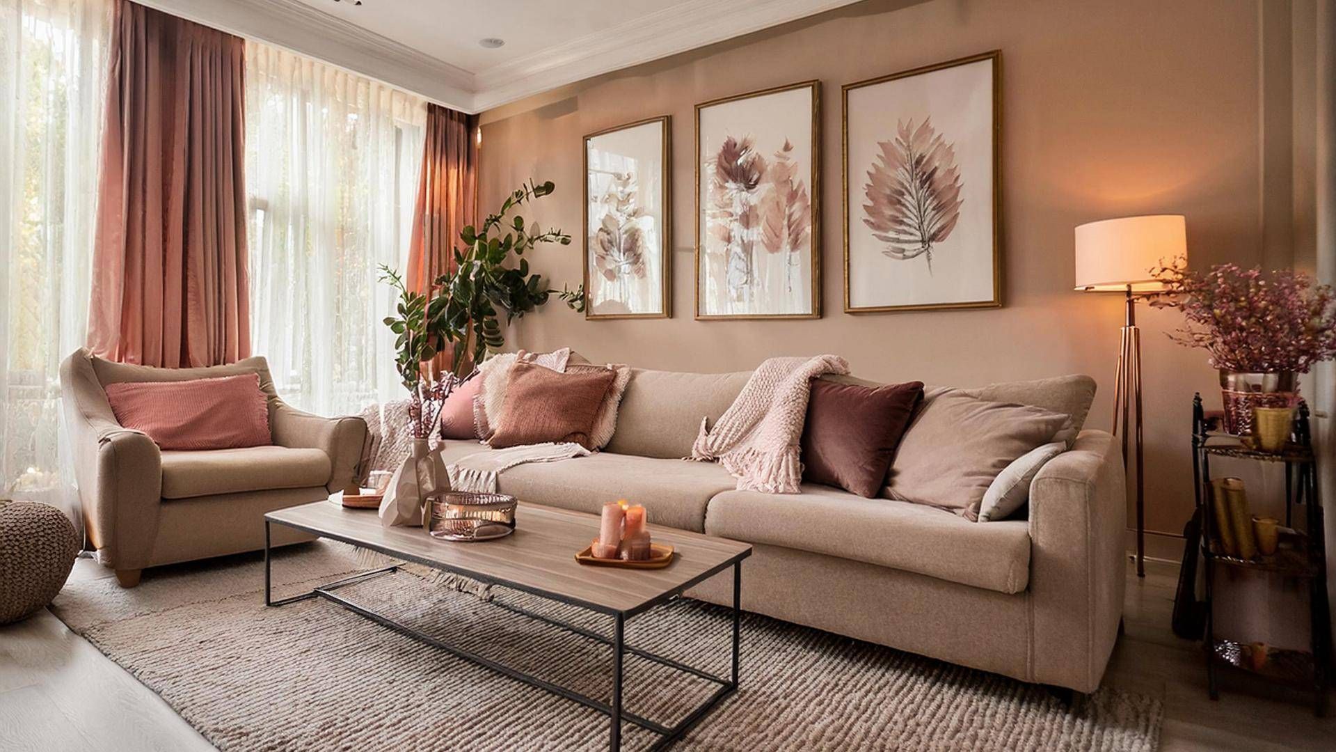
1. Accessories: red pairs well with white or cream, with the ability to turn a bland backdrop into an interesting interior. Red scatter cushions on a cream sofa or a red light shade against a white ceiling really draw the eye without the overload.
2. The statement piece: sometimes just one bold red item speaks volumes. A front door painted chilli pepper, a scarlet dining table or a fire-engine red Smeg fridge freezer carries all the impact that’s needed.
3. The compromise: if you can’t quite bring yourself to install floor-to-ceiling red, use a decorative moulding to dilute the look. A dado rail will roughly divide a room in half, while a picture rail will give you an approximate 80:20 split. Paint a shade of red on the bottom half and use a complementary neutral above.
There’s nothing like moving into a new property and putting your own creative stamp on each room. If you’re in the market to move home, please get in touch for a list of available properties.
Share this article
More Articles
Sign up for our newsletter
Subscribe to receive the latest property market information to your inbox, full of market knowledge and tips for your home.
You may unsubscribe at any time. See our Privacy Policy.


